I don’t really get to post much about actual projects for a couple of reasons. My work is usually behind the scenes graphics coding, which typically result in posts about the techniques rather than the projects themselves. In my last project, a showcase project for the new Porsche 911 with the German agency UDG, I was the user of a 3D engine for a change. Focusing on how things look rather than how things work was a nice change of pace. Furthermore, I was lucky to work together with two close friends: Frank Reitberger, taking the reins of our sub-team and catching the inter-team blows, and Simo Santavirta who worked on a lot of the playful background stuff, animations, and so on. Maybe they’ll put blog posts online about their parts, but I’ll just focus on my contributions here.
First of all: check out the project here!
My tasks (the ones I want to talk about anyway, no one cares about 100 iterations of model imports and texture compression) were mainly shader and engine-oriented: materials, reflections, etc. The engine in question is Mr. Doob’s ever popular Three.js. In what follows, I’ll explain some of the things I did in the projects in words and concepts, not code. If anyone wants to know more about some aspect or other, just let me know.
Project overview
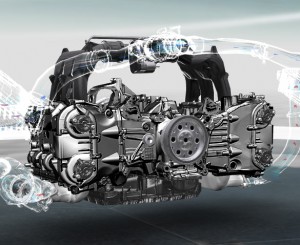
The project itself is a 5-chapter showcase for Porsche’s latest 911 models, showing off some facets they seem to be pretty proud of: design, perfomance (showing off the engine), driving (showing off the wheels/axles), some weird things the headlights do when turning, all that jazz! Parts of the site also had to run on newer mobile devices.
There were a couple of immediate challenges and we had to give the 3D modellers a really hard time to get poly & draw call count down as much as possible, as well as the amount and sizes of the textures.
(Oh, and I’ll admit it, I know nothing about cars. I don’t even have a driver’s license, nor do I want one. So yeah, most communication happened as “that springy thingy” or “that punchy thing inside the engine”. Since UDG is a German company, I did pick up on some great vocabulary. The winner? “Auspuff”, meaning “exhaust pipe” :’) Anyway… moving on.)
Custom work is more fun
Most of the work we had to do, even if you can’t tell by looking at it, required a degree of custom work. We hacked the three.js codebase in places in order to splice in our changes (I can’t say I generally like being limited to out of the box stuff, and neither should you). The materials were all custom-built so we had full control over lighting models, which type of lights to use depending on the material, baked maps, custom reflections, and weird animation code.
To give an example of the less obvious: small lights, lens flares or highlighted car parts are made by quads that always point towards the camera. When done manually with default code, these quads would intersect with the car’s geometry and not be visible (unlike an actual flare which scatters inside the lens). So the quad should be in front of regular geometry, but still fade out depending how much geometry occludes the light itself. Rather than doing expensive occlusion tests like a default lens flare (there is code for that in the examples repository), we managed to make these things work by changing the vertex shader’s depth value and some algebra. It’s not perfect, some cut-off still occurs, but it works well enough given some patience to tweak the numbers since it’s not a complex occlusion situation (and it’s much more performant).
Similar tricks were used to get some of the transition animations to work: changing wheels in the showroom required some depth buffer trickery to make them morph into eachother nicely.
Materials
Most of the material shaders were built keeping physical plausibility in mind. Given the limitations of WebGL and not being able to use some extensions, we couldn’t go all the way with this. No floating point textures, so no HDR to work with, we solved some things by for example simply scaling environment map values. All of the materials do have fresnel-based BRDFs with normalized distribution functions (we mostly avoided geometric self-shadowing or foreshortening terms for performance reasons). Expecting limited overdraw, we used Three’s forward renderer which gave us a lot of flexibility to tweak lighting models and materials as required for the surfaces. The scene was relatively static, so all shadows are just baked light- and ambient occlusion maps.
All materials except for the very rough ones (where it would be a nearly invisible waste of resources) use an environment map. We couldn’t rely on the EXT_shader_texture_lod extension so a mip-chain to handle different roughnesses was out of the question. Instead, we settled for 3 separate environment maps. The largest one for very smooth surfaces was one that’s updated at real time to represent the actual environment. The two others, for different degrees of roughness, were baked convoluted cube maps. These were generated using Knald’s Lys, a tool I’ve grown very fond of. When required, the environment map was assigned a size and position in the shader. That way, we could calculate where the reflection ray intersects the reflection cube, resulting in much more locally correct reflections, which is especially important for the many flat surfaces we were dealing with.
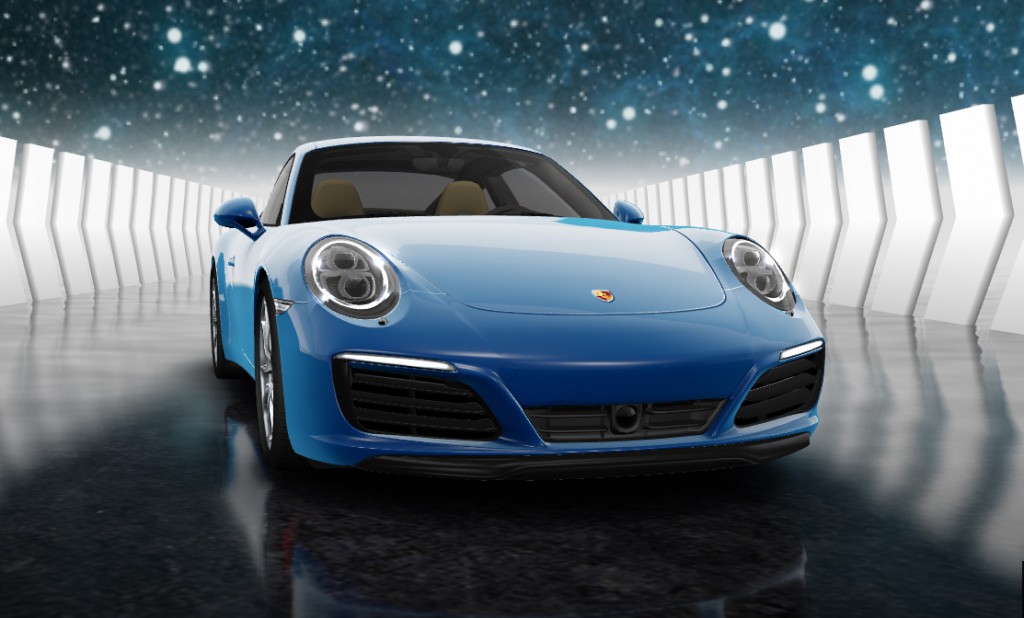
The car paint has a GGX Trowbridge-Reitz specular distribution model to get nicer highlight tails that allow for a better soft metallic look. Normals are perturbed both with a normal map and a fleck texture to get some subtle metallic flecks in there. I had hoped to be able to spend more time on the actual metallic clear-coat shader, but instead I had to adapt what we already had to match a series of Photoshopped screenshots (I had forgotten this is how 2D-oriented people like to work ;) ). The diffuse paint model supports a fresnel-based multi-layered “douchebag” paint effect, but that actually turned out to be little used except to add some depth in the paint: there’s no actual douchebag paints in the showcase. What a pity! With some tweaking and subtle use, however, it sometimes even gives a slight impression of subsurface scattering, which is always a nice extra with car paint.
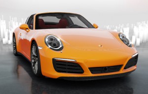
Other “solid” materials just use the normalized Blinn-Phong model with regular Lambertian diffuse scattering. The metallic materials of course just use specular reflections: at least an environment map and optionally including the scene lights. In this case, the albedo colour is used as the normal incident specular reflection colour. In the picture on the right, some are black metal (kvlt!), some are more regularly coloured, but all are metal. Apart from this, there’s also optional self-occlusion maps that can be used to darken some of the reflections in niches.
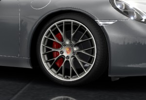
I’ve been told the car rims aren’t actually metal, but they do seem to exhibit some definite metallic reflections. To get them to look convincing – but not quite chrome-like – we used a hybrid model. Basically, it’s a somewhat regular Blinn-Phong model with normal incidence reflections boosted, while reducing diffuse reflections based on the specular boost. Not very different from changing the “metallicness” value in something like Unreal.
Glass materials are mostly just environment maps using the Fresnel factor as alpha with normal alpha-blending. In the case of the car windows, there’s a layer that uses multiplicative blending to darken what’s behind it before applying the environment map in a second pass. It’s considerably more realistic than doing everything in one pass with default blending.
Most of the “special effect” materials such as the highlights are simply a flat colour with fresnel-based fall-off (think rim-lighting), and additive blending. There’s also some depth offset being applied to allow overdraw of near pixels while still preserving most occlusions.
Floor reflections
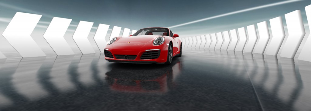
Reflections getting softer away from the floor
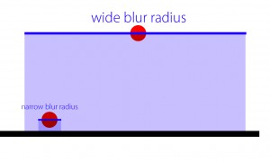
One of the most striking aspects of the original mood boards were the reflections of the car and the environment on the floor. Somewhat soft reflections as in real life: perfect reflections where the objects touch but getting blurrier the further away it is from the surface. Obviously we wanted to replicate this in the project as well. There is code out there to do planar reflections in three.js, but those result in perfect mirror-like reflections. To get what we wanted, we built our own reflection renderer, much like what I did for Away3D back in the day (see this) with some optimizations/omissions: our reflecting plane was always aligned with the XZ plane going through the origin without the camera ever crossing it. In other words: mirror the camera vertically and render the scene to a texture. To get the distance-based soft reflections working, we had to have all the materials output the fragment’s world space Y coordinate to the alpha channel.
Using the alpha value, we could calculate an approximate distance of the reflected point to the floor, which in turn could be used in the blurring stage. That blurring worked very much like a depth-aware blur. First, the central point is sampled to figure out how far that is from the floor. This distance is used to calculate the basic blur radius. Every point that’s then sampled within the blur radius has a weight calculates based on its own distance, so we can calculated a weighted average at the end. If we wouldn’t do this, objects close to the surface would be included in the blur of an object further away, which should not always be the case.
The final blurred texture is then used when rendering the floor itself, as with normal planar reflections, using the floor normals to perturb the sampled point a bit.
Last words
I’m not sure in how far a write-up like this is useful, as – again – it’s not something I get to do all that often. But at least I can show an actual project!
In the past year or so, I’ve gotten pretty comfortable with WebGL and while it always feels like a step back from all the amazing things you can do with desktop tech (what?! no compute shaders?!), the fun is also in the limitations themselves: finding cheap solutions or approximations with what you’ve got. I’ll never be a fan of Javascript – or even Typescript – tho ;)
Thanks for the writeup, interesting read! Still learning 3D programming myself, nice to hear about the process from professionals :)
What on earth is a “douchebag paint effect”?
Duotone, Fast & Furious style :D
Duotone, Fast & Furious style! :)
I think the “douchebag paint effect” refers to color changing “chameleon” paint. lol
is this posted anywhere? the link just goes to the new 911 site.. thanks!
Hi, sorry for the late reply; it looks like WordPress stopped sending me notification mails… You’re right, the project is no longer online :(
Hello, I loved this site that you built. Do you have it anywhere for me to look at and gain inspiration? Man, I’m so bummed that it’s down.
Thank you.
Sincerely,
Ricardo Parker
Excuse me, where can I find this project? the link just goes to the official website.
Hey Simon,
It’s an old project and it has been taken down a few years ago. Sorry!
I am now doing some ground reflection-related content, and I like the reflection effect mentioned in this paper very much. I want to know how to realize it. Can you share the source code or any relevant information ?